How to create a “film” preset in Lightroom
Looking to try film but only have a digital camera? Or trying to create a consistent look across mediums? We'll take a look at a film photo, understand its traits, and then go into Lightroom and recreate those with a digital photo.
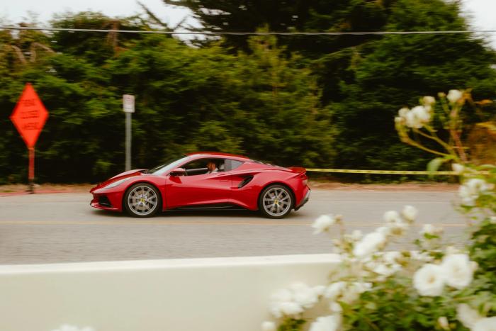
Every film stock has a unique look, so we’ll focus on the “consumer” grade stocks like Kodak Gold 200 or Pro Image 100. Both of these have an overall warm tone with moderate contrast and saturation with Pro Image having a little more of each. The image above on Pro Image 100 shot in broad daylight.
In addition to a warm tone, film does not have true blacks or perfect highlights. Depending on the lighting and your subject, often times highlights will be blown out to achieve enough shadow detail.
With that in mind, let’s dive into Lightroom and adjust the tone curve.
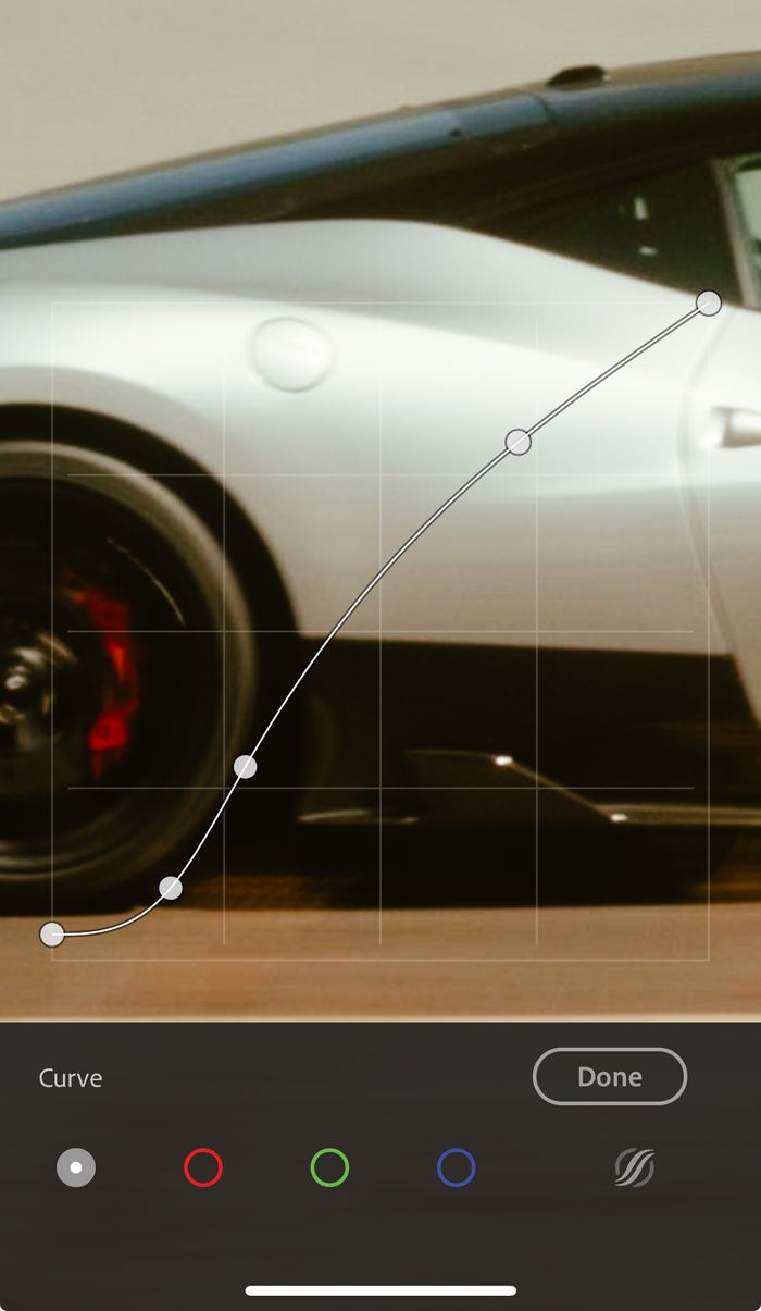
First, we want to bring up those black levels. This will give us more of a dark grey and muddy up the shadows. The next two points are balancing the contrast and giving us some saturation. You can choose to skip them if you like a more neutral or “overexposed” pastel look. Play around with it and find your balance, film has a lot of latitude in how it is scanned and processed. The final point is our highlights. If you follow my curve you’ll find that I’m bringing it down just a touch, to maintain contrast in the upper-mid tones as the highlights go to true white.
This tone curve will get you 80% of the way towards a film look! The next factor will be color grading. We need those warm tones right?
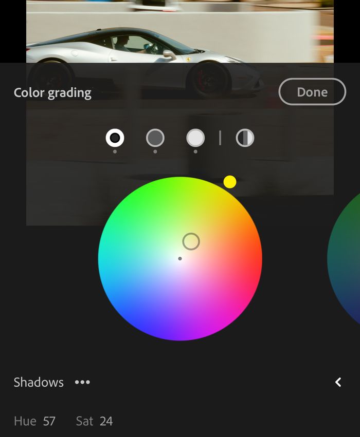
First up is the shadows. We want warm and we want yellow. This will have the highest saturation of the color grading.
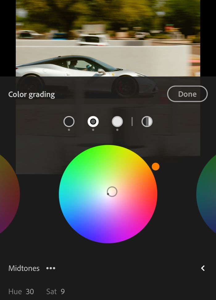
Next up is our mid tones. Notice how the asphalt has red/orange undertones? We are recreating that here. Don’t go too heavy with saturation, it’s easy to overpower your image in this step.
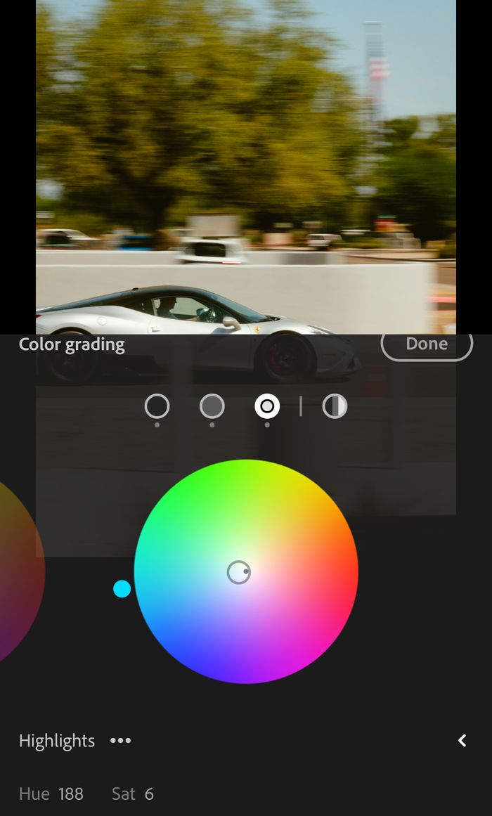
Next up is the highlights! Now, why are we adding cyan? Take a look at the sky, we have a lot of white with a slow gradient into green/cyan. This will give you those green tones in other parts of the image and give your sky the turquoise tones we all desire.
So now we’re 95% of the way there! Your photo should be looking pretty film like by now. Up next are the basic edits that you can change from photo to photo.
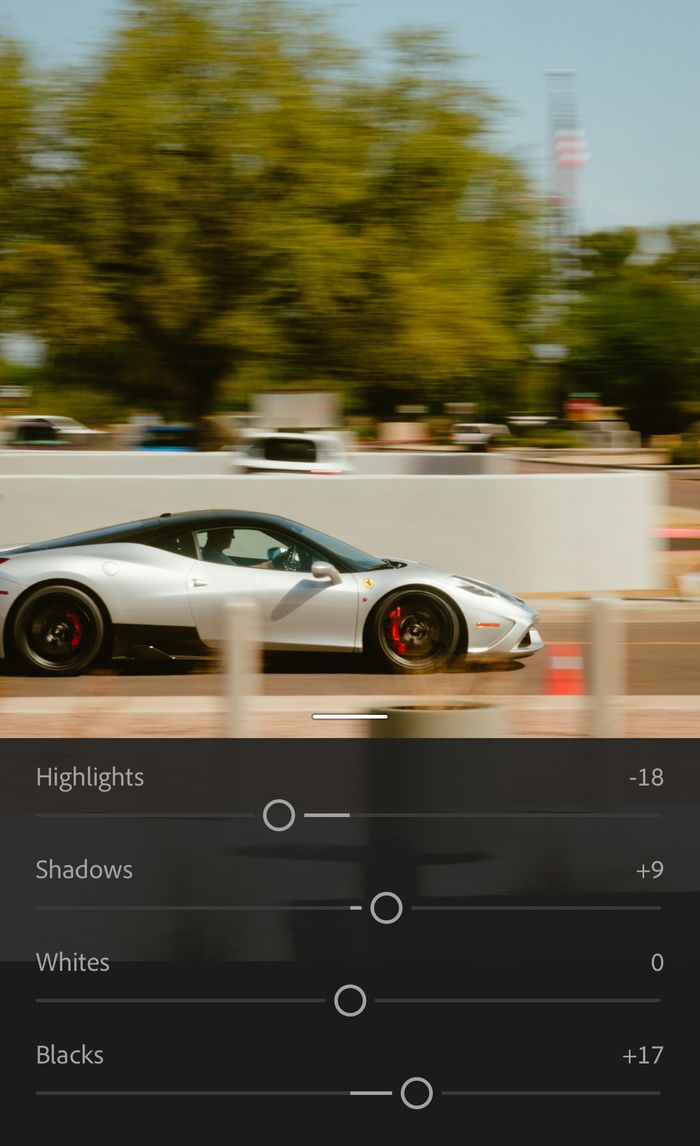
These will largely be based on how you shoot! Every camera has unique qualities to their RAW files and every photographer has their preference for exposure. In general, I bring up the shadows more, bring up the black levels, and adjust highlights depending on my subject. In this case it was a silver car where I was concerned with having too much “glow” and brought them down. However, if you desire more glow feel free to leave the highlights as is and lower your clarity to -10/-15. This will take the digital “edge” off your image. Otherwise, a pro-mist filter at 1/4 strength will yield similar results.
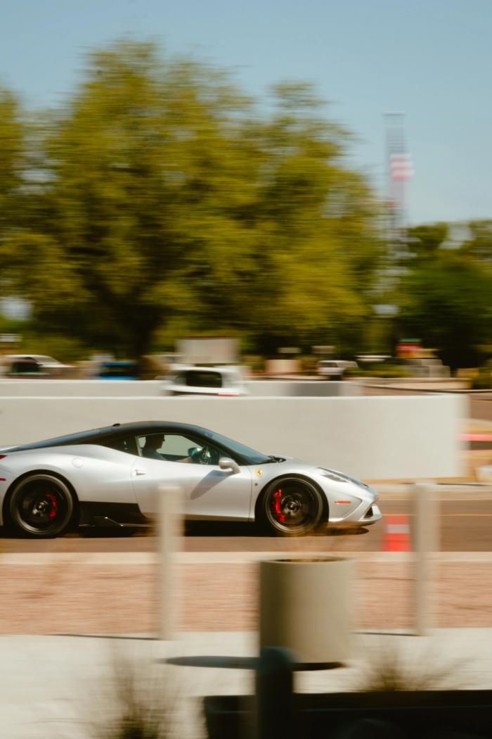
Here is the final image:
Hope this was able to help and you’re happy with your new preset! Please reach out and send me the results! If you’d like to support me, instead of buying a preset - buy a print! Thanks for reading!
Read More